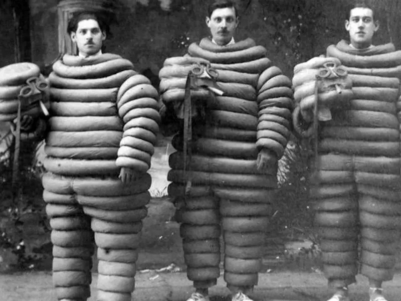
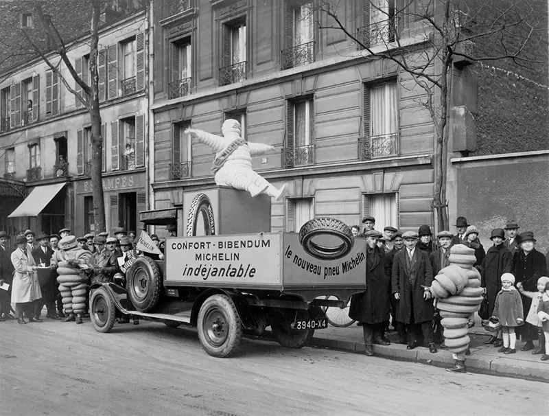
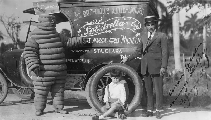
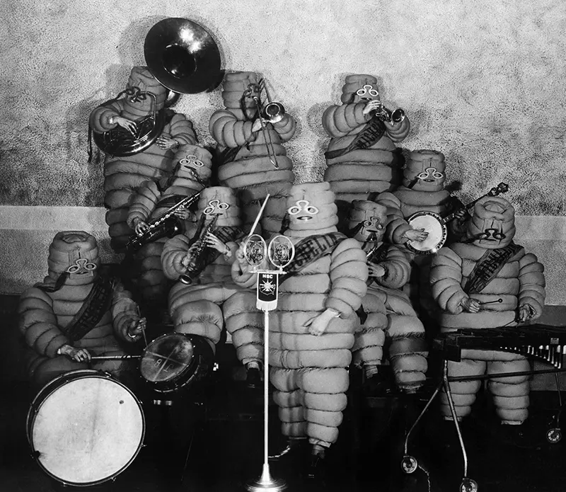
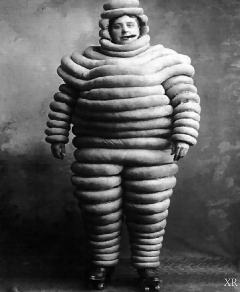
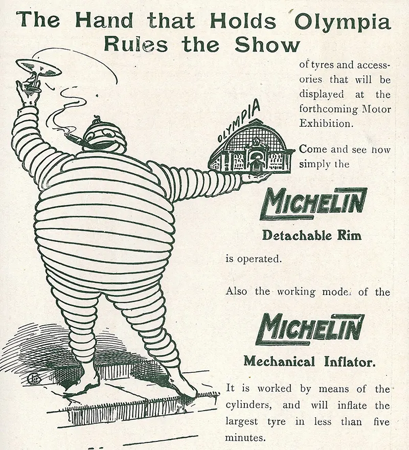
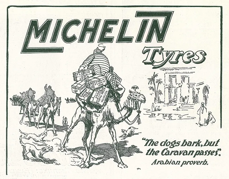
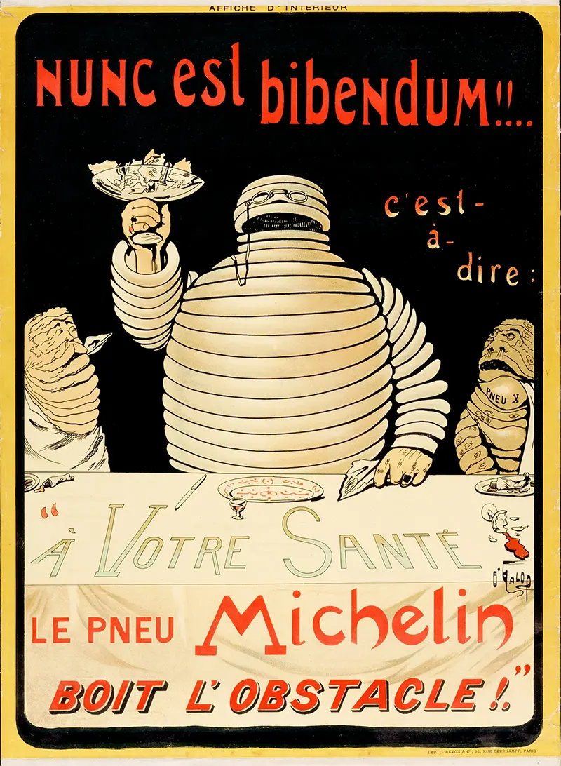
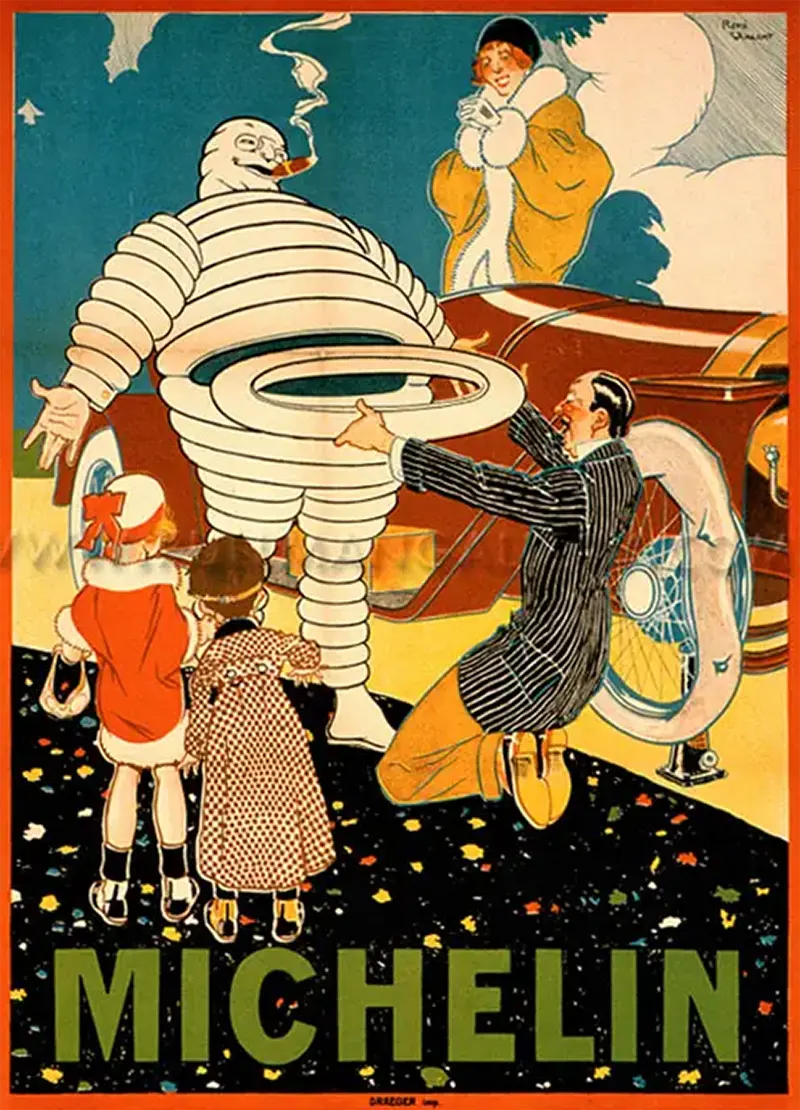
Among these iconic figures, one stands out with its unique blend of charm and terror: the Michelin Man. The story of the Michelin Man begins in 1894 when the Michelin brothers, André and Édouard, founded the Michelin Tire Company in France. Seeking a distinctive brand identity, they turned to the world of advertising. While attending the Universal and Colonial Exposition in Lyon, the brothers noticed a stack of tires that suggested to Édouard the figure of a man without arms. Four years later, André met French cartoonist Marius Rossillon, popularly known as O’Galop, who showed him a rejected image he had created for a Munich brewery—a large, regal figure holding a huge glass of beer and quoting Horace’s phrase Nunc est bibendum (“Now is the time for drinking”). André immediately suggested replacing the man with a figure made from tires, and O’Galop adapted the earlier image into Michelin’s symbol. This unusual and striking persona would soon take on a life of its own. The 1898 poster showed him offering the toast Nunc est bibendum to his scrawny Brand X competitors with a glass full of road hazards, with the title and tag C’est à dire: À votre santé. Le pneu Michelin boit l’obstacle (“Now is the time to drink!! Which is to say: ‘To your health, the Michelin tire drinks down the obstacle[s]!”). The character’s glass is filled with nails and broken glass, implying that Michelin tires will easily take on road hazards. As the decades unfolded, the Michelin Man underwent a metamorphosis, evolving from a mere graphic representation to a three-dimensional figure with a rich personality. However, it was during his early years that the Michelin Man left an indelible impression on the collective consciousness. These vintage photographs offer a mesmerizing glimpse into the origin and evolution of this iconic symbol. Rubber tires were originally gray-white, or light or translucent beige. In 1912, they became black when carbon was added to them as a preservative and strengthener. The company changed Bibendum’s color to black as well, and featured him that way in several print ads. They decided to abandon the change, citing printing and aesthetic issues (not racial concerns, as is commonly believed). The image of the plump tire-man is sometimes used to describe an obese person, or someone wearing comically bulky clothing (e.g. “How can I wrap up warmly without looking like the Michelin Man?”). Bibendum’s shape has changed over the years. O’Galop’s logo was based on bicycle tires, wore pince-nez glasses with lanyard, and smoked a cigar. By the 1960s, Bibendum was shown running, often rolling a tire as well, and no longer smoked. In 1998, his 100th anniversary, a slimmed-down version of him (sans glasses) was adopted, reflecting the lower-profile, smaller tires of modern cars. A computer-animated version of Bibendum has appeared in American television ads, with a pet puppy similar in appearance to him. Looking ahead, the Michelin Man continues to hold a significant place in the realm of brand icons. As technology advances and new avenues for visual storytelling emerge, we can expect the Michelin Man to adapt and evolve while preserving its distinctive essence. Whether it be through traditional mediums or digital platforms, this timeless character will continue to captivate and inspire audiences, transcending the boundaries of time and leaving an enduring mark on the cultural landscape.
(Photo credit: Michelin / Wikimedia Commons / Flickr / Pinterest). Notify me of new posts by email.
Δ Subscribe
